Typography Best Practices for Mobile Applications
Chosen theme: Typography Best Practices for Mobile Applications. Welcome to a friendly, practical guide crafted for designers, developers, and product teams who want text to feel effortless under the thumb. Stay with us, share your experiences, and subscribe for fresh, field-tested insights every week.
Foundations of Mobile Typography
Start with platform-native defaults: 17pt for iOS body, 16sp for Android. These sizes respect accessibility settings and reduce eye strain on dense screens. Design with tokens mapped to semantic text styles, not hardcoded pixels. Share your preferred base size and tell us how it performs across devices.

Choosing Typefaces for Small Screens
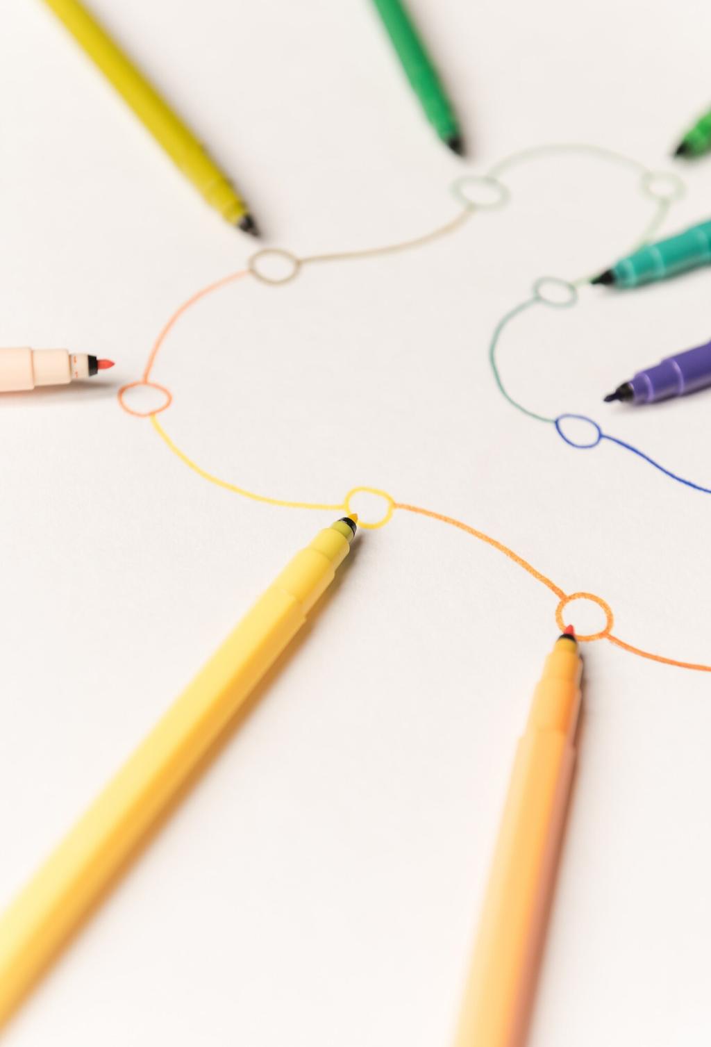
Humanist sans for warmth and clarity
Humanist sans faces like SF Pro, Roboto, and Inter offer open counters, generous x-height, and calm diagonals that survive tiny sizes. They feel approachable while remaining efficient in UI. Try side-by-side legibility tests at 14 to 16 points. Tell us your favorites and why they win on your product.
System fonts versus custom fonts
System fonts deliver instant familiarity, excellent hinting, and zero download cost. Custom fonts strengthen brand voice but require careful licensing, loading, and fallback planning. Consider hybrid strategies: system fonts for UI, custom for marketing surfaces. What mix works for you? Comment with your stack.
Using variable fonts intelligently
Variable fonts pack multiple weights and optical sizes into one file, reducing requests and enabling fluid typographic motion. Still, file size can grow and low-end devices may struggle. Subset thoughtfully and cache aggressively. Subscribe for our upcoming guide to variable axis presets for mobile UI.
Hierarchy and Scale that Guides Thumbs
Build a scale that respects platform guidelines: for example 12, 14, 16, 20, 24, 32 with weights that avoid fake contrast jumps. Keep body no smaller than 16sp or 17pt, and treat 12 to 14 as supportive metadata. Share your tokenized scale and we will feature smart examples.
Hierarchy and Scale that Guides Thumbs
Helper text and labels should use clear language, not shrunk type. Emphasize with weight, color, or spacing rather than miniaturization. Avoid all caps for longer phrases; it slows scanning. Try short, scannable sentences. Got a microcopy win that reduced support tickets? Tell us your story.

Spacing, Grids, and Rhythm
Use 4 or 8 point spacing increments to create predictable vertical rhythm around text blocks, captions, and buttons. Align typographic baselines to these increments where possible. This reduces design debt and speeds development. Share your favorite spacing tokens and how you map them to text styles.
Spacing, Grids, and Rhythm
A pixel-perfect baseline grid is lovely on a poster, but mobile is messy. Aim for consistent leading and optical alignment at section boundaries. Embrace slight exceptions for icons and truncated text. Document these rules in your design system and invite your team to challenge unclear cases.
Spacing, Grids, and Rhythm
When space is tight, prefer multi-line wrapping over aggressive truncation for critical content. If truncation is necessary, provide clear affordances like a show more pattern. Avoid orphan words in headlines by tuning line breaks. Send us screenshots of tricky cases and we will propose elegant patterns.
Accessibility and Localization
Support Dynamic Type on iOS and Font Scale on Android. Map tokens to semantic styles so system settings enlarge content predictably. Test extreme sizes with real flows, not just sample screens. If your app handles 120 percent scaling gracefully, share your approach and we will compile community tips.
Accessibility and Localization
Design with CJK, Arabic, Hebrew, and Devanagari in mind. Provide robust fallback stacks, adjust line height for taller scripts, and confirm shaping features like ligatures and kashidas. Never assume character widths. If you localize to new markets, subscribe for our multilingual typography checklist.
Dark Mode and Color Systems
Pure black can cause halos and hard edges; near-black like #121212 often looks smoother. Use slightly softened white for text to reduce glare, while maintaining AA or AAA contrast. Test in a dark room and daylight. Share your preferred pairs and we will publish a community palette.
Performance and Rendering
Font loading that respects users
Use preconnect and preload for critical fonts, then font-display swap to avoid invisible text. Plan fallbacks that maintain layout width to limit reflow. Measure time to readable text across network conditions. If you have a proven loading recipe, share it and help others ship faster experiences.
Subsetting and fallbacks
Subset fonts to essential glyphs for initial loads, then stream additional sets as needed for localization. Keep reliable fallback stacks to avoid tofu boxes. Document character coverage per market. Subscribe for our step-by-step guide to safe subsetting without breaking international typography.
Rendering quirks in the wild
Different GPUs and OS text renderers treat hinting, kerning, and subpixel antialiasing differently. Validate on multiple Android OEMs and iOS versions. Beware fractional scaling rounding errors that blur small text. Share screenshots of oddities and we will compile fixes and workarounds.

Real-world readability tests
Run quick guerrilla studies on buses, in parks, and under bright lights. Measure time to find key actions, error rates, and rereads. Track improvements after typographic tweaks. Tell us your best scrappy study techniques and we will feature them in an upcoming community guide.
A small team’s big win
A startup raised activation by nine percent by bumping body to 17pt, tightening headings, and increasing contrast in dark mode. Support tickets about confusion dropped within a week. Their brand felt the same, only calmer. Got a similar story? Share it and inspire others.
Build a feedback loop
Instrument readability metrics, invite in-app feedback, and review screenshots from support tickets. Maintain a backlog of typographic issues and ship fixes alongside features. Subscribe to our newsletter for templates, checklists, and monthly office hours focused on mobile typography craftsmanship.